California Council for Interior Design Certification (CCIDC)

Increased task efficiency by 62.5% for the application flow and created a higher retention rate for interior designers.

Overview

Revamping the application process to simplify applying for interior design certification.

The California Council for Interior Design Certification is a non-profit organization that aids interior designers in the certification process and aims to uphold the standards of interior design in the community.

Working with a cross-functional team, I simplified the process of submitting documents and relevant information to make the application process more intuitive and less time consuming for users.

Timeline: Sep 2023 - May 2024 (9 months)

Role: Lead UX Designer

Team: 2 UX Designers, 10 Developers, 1 PM

Tools: Figma

The Problem

Fewer people were applying for certification through CCIDC's website leading to a smaller talent pool.

Our client at CCIDC discussed the organization's needs with us, highlighting a concerning trend: a decreasing number of applicants each year. She attributed this decline to competing organizations offering more streamlined application processes for interior designers.

This challenge has hindered CCIDC's ability to build a network of properly certified interior designers who can effectively connect with clients to complete essential projects.

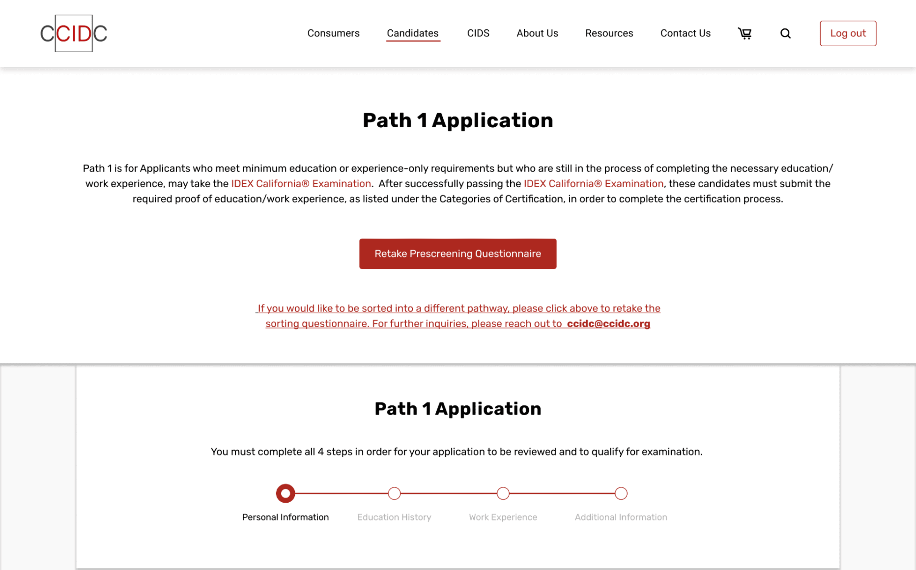
The Final Designs (a sneak peak)

The CCIDC website concerning the application for interior design certification…

01

Explaining the application process.

Redesigning the landing page to intuitively guide users towards understanding the benefits of applying and the differences between the four pathways.

02

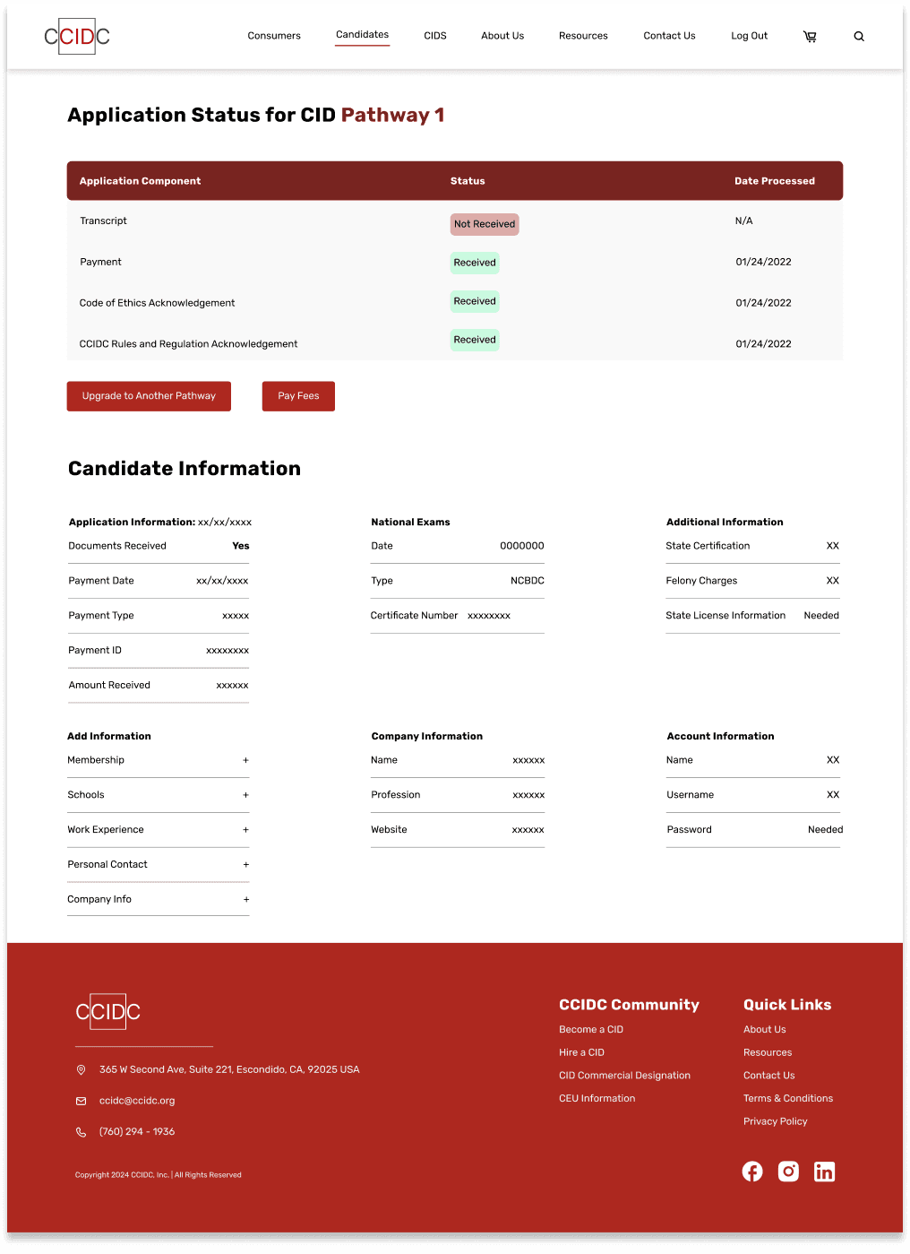
Sorting and saving the applicants.

Adding a prescreening questionnaire to ease applicants' cognitive load by automatically sorting them into the correct pathway and prompting them to sign in, creating a dedicated space in the system.

03

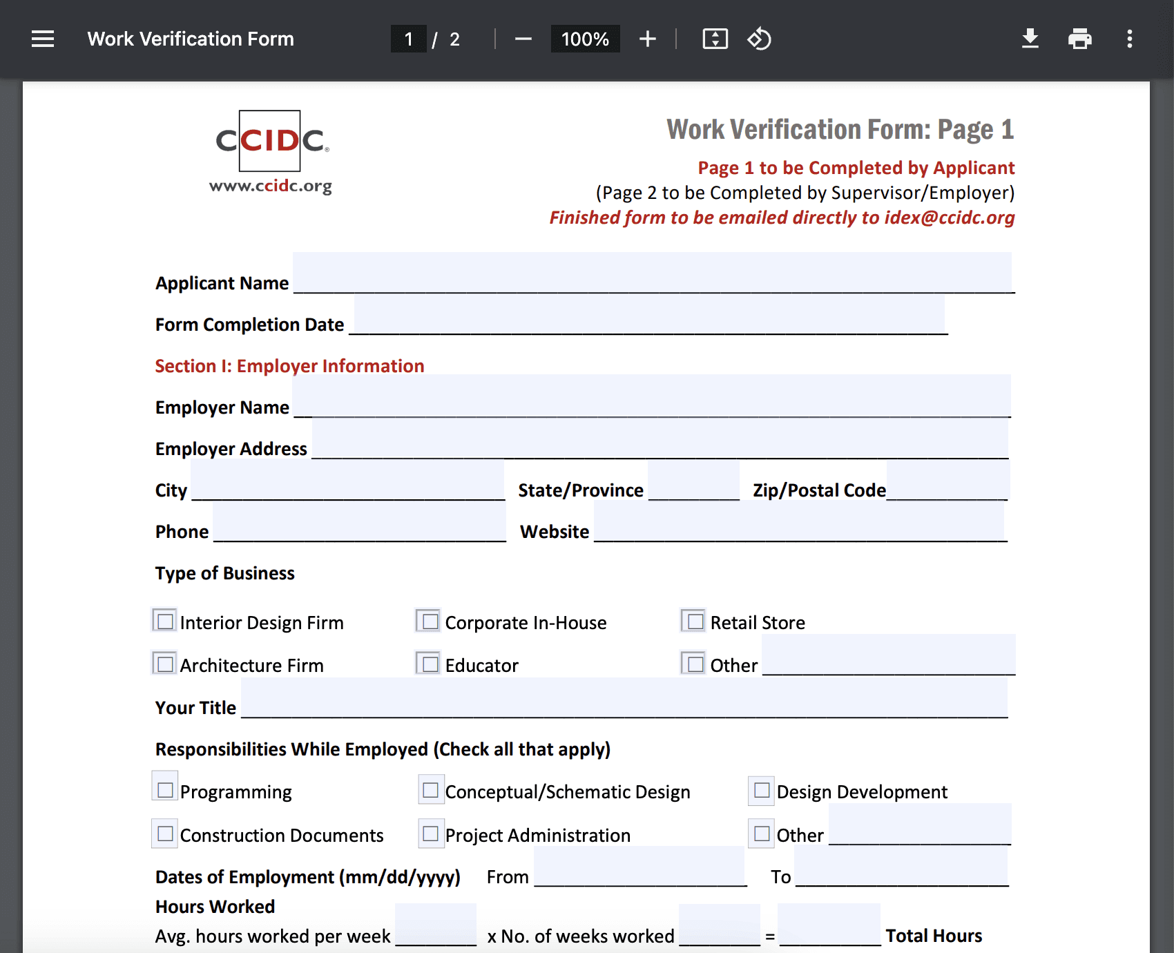
Simplifying the application itself.

Consolidating links, document uploads, and personal information so that both user and employee can include the information all at once.

Usability Analysis

Starting by assessing the existing website.

Become a Certified Interior Designer Page

Candidate Information

FAQ's

Application Facts

Pathways

Candidate Information

FAQ's

Application Facts

Pathways

Candidate Information

FAQ's

Application Facts

Pathways

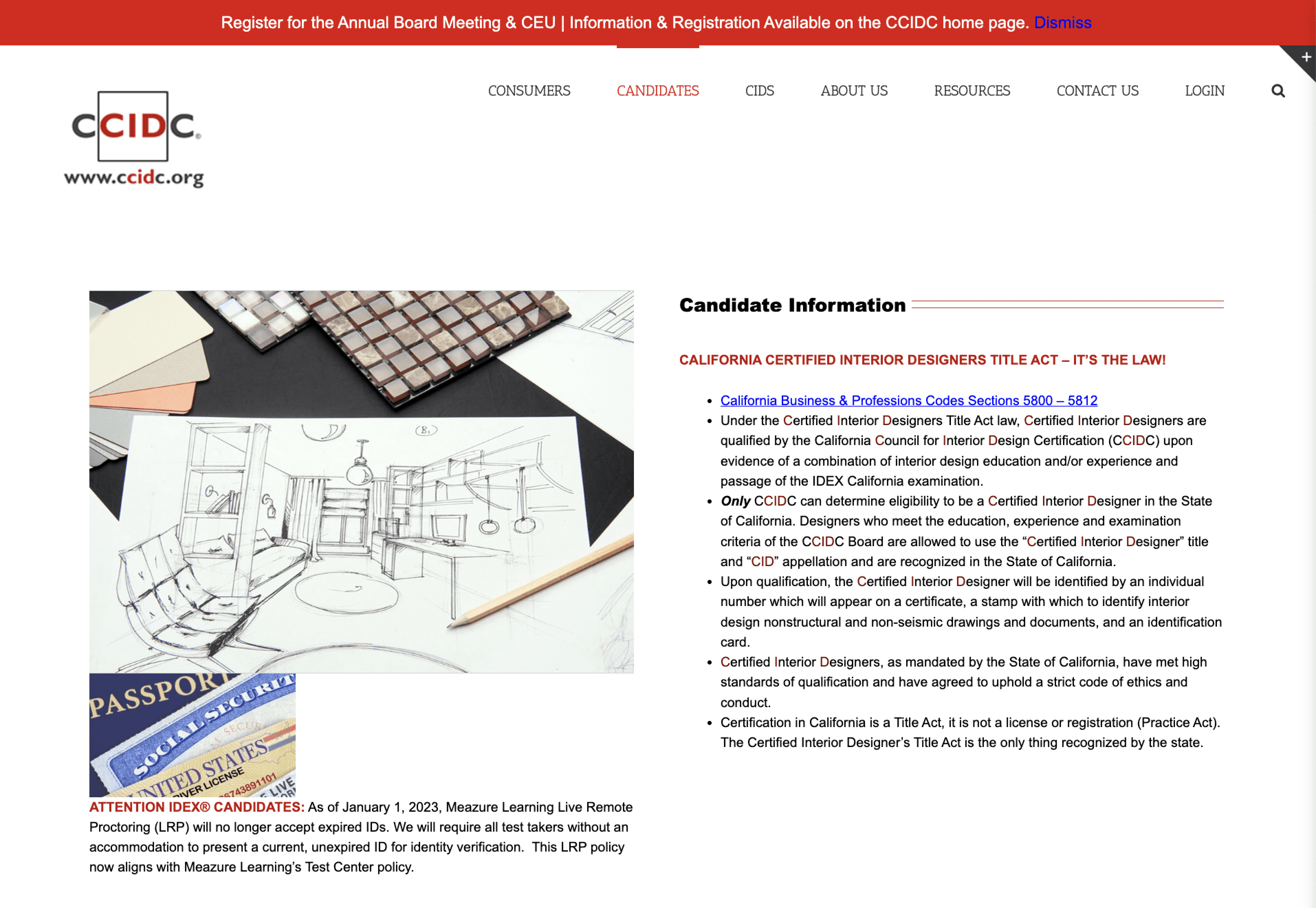
Our analysis of this section alerted us to the following usability issues:
1. 'Become a CID' page suffers from poor organization and repetitive content
2. It is particularly difficult to read all of the information due to sheer amount

Application Flow

Step 1

Step 2

Step 3

Step 4

Step 5

Step 6

This section revealed more usability issues:
1. The steps are complex particularly because of the several pdfs that open in other tabs and need to be submitted via email
2. There is also an unnecessary amount of information presented in paragraph form
3. Work history and other personal information must be submitted as part of sub steps associated with the 3rd step

User Interviews

Understanding the specific pain points applicants had with navigating the process.

Now that we had assessed the existing site from a usability perspective as designers, we aimed to gain a deeper understanding of our users' needs and pain points. With the assistance of our Product Manager, we distributed user surveys and, from the eight responses we received, identified the following areas in need of improvement.

Layout and Visual Aesthetic

62.5% of users found it difficult to read through text and synthesize key information on the site due to the unappealing interface and crowded text.

“different sizes of fonts or images sizes make the website hard to navigate. establishment of a better hierarchy, using boldened text, spacing, and colors, would help absorb the information better”

Clarity of Process

100% of users were unsure which pathway to apply under and how to complete simple tasks associated with the application.

“It was difficult to save and go back to my application, and it was unclear on how to submit required documents after submitting my initial application.”

This led us to asking…

How might we enhance the user experience and streamline the application process to become a certified interior designer, increasing the total number of applicants and reducing the time required to complete the application?

Solution Ideation

Discovering the best solution for a smooth application process.

Based on our explorations, we collaborated closely with our client to align user expectations with business needs and create an experience that met everyone's needs. We focused on the following features when proceeding with our redesign.

01

Automatically sorting applicants.

02

Reducing application steps by creating a single submission process.

03

Saving applicant progress through an account creation system.

04

Making the information about the process more digestible.

Mapping the user flow to set up our redesign.

To visualize our solution more clearly, I mapped out the features for our redesign and made sure users would be able to intuitively navigate it all.

The user flow was also important because it was the first tangible design choices I was able to share with developers and our client. Based on this, we were able to align on our expectations and establish timelines going forward.

Creating wireframes and Lo-fi's to further visualize features.

Becoming a CID Page

Prescreening Questions

Pathway Steps

Design System

Utilizing a design system to create hi-fi designs more efficiently.

Before diving into designing high-fidelity screens, we aimed to establish a design system to ensure consistency. We utilized TSE Constellation, the design system for our student organization, in collaboration with CCIDC, incorporating their established brand colors and fonts.

Typography, Buttons, and Colors

Modals and Icons

Iterations and Usability Testing

Creating multiple versions to determine what will be best received by users.

We started with making multiple stylistic iterations on the 'Become a CID' page to determine what was best received by our client.

During the iteration process, I ensured that developers understood how interactions worked by creating comprehensive documentation. This included utilizing Autoflow, Figma's dev mode, and detailed interaction descriptions like the one below.

We also consolidated the application flow into 3 and 5 step application flows. We weren't sure what would make sense for our users so we conducted A/B testing on a group of 12 users. By examining the results, we found 9/12 Users preferred Version B. We continued to iterate on this version.

Pivoting due to developer constraints

Originally, we intended to include a redesigned payment page and an applicant status page. However, due to development timelines, we were unable to implement them.

Although we were disappointed that we couldn't implement the redesigned pages, I learned the importance of prioritization during this period. I was pleased that we addressed users' main pain points first, allowing secondary features like the application status to be designed later, ensuring that development could focus on the most critical aspects.


We still designed new versions of the pages and presented them to the client, along with detailed documentation, in case they acquired the resources to develop them in the future.

Conclusion

Next Steps

All our designs have been handed off to the development team and are now being implemented. We are maintaining communication with the client to ensure alignment on our expected timelines.

Reflection

It’s important to have a solidified product roadmap for the whole team - This provides clear direction, aligns efforts across teams, and helps anticipate and manage potential challenges proactively.

Clarifying with the client + asking a lot of questions is a big part of the design process - These actions help ensure that all requirements are thoroughly understood and that the final design meets the client's expectations and goals effectively.

Small changes in design can make a big difference in development so documentation is important - Clear documentation ensures that all design decisions and revisions are communicated effectively, facilitating smooth collaboration between design and development teams.

Thanks for exploring my little corner of the internet :)

Let's stay in touch!